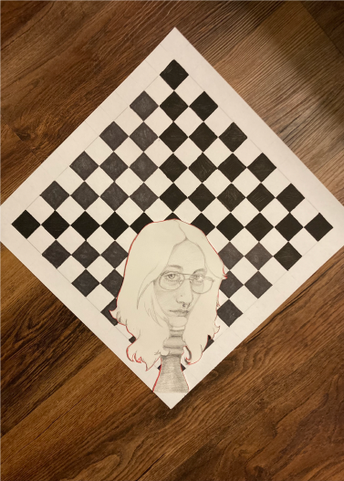
Poignant Self-portrait
Traditional
This project was based on an assignment in which we were instructed to create a self-portrait abstractly. I took that idea and ran with it creating a piece where I am a pawn on a chessboard. At this time in my life, I was struggling a lot with feeling out of control and this was my take on that. The main artwork is composed out of graphite and the chessboard is black permanent marker to really give it dark darks. The title comes from the fact that my head’s on a pawn and aligns with the events going on in my life at the time.
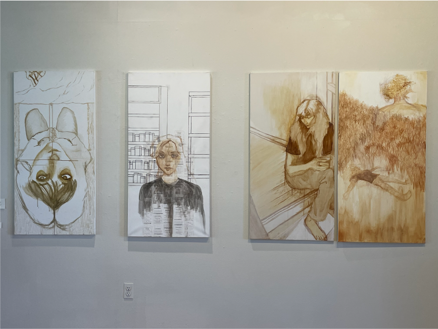
Grief
Traditional - 7 Works
Grief has been here for eternity but Kübler-Ross modeled it into five stages in nineteen-sixty nine in her book “On Death and Dying,” referred to as the Küber-Ross model. The thing is though, grief isn’t something linear or something that could simply be put into stages. It’s something that you personally have to go through to truly understand it. Having my own grief, I had never dealt with something so life-changing and freeing. My approach was seven individual paintings each with their own stage. The paintings follow a persona and my experiences, my thoughts, my feelings with a recent break-up. Bringing my own personal life to the forefront, I want my audience to feel seen and be able to relate with their own experiences while also recognizing that all grief is different. As they walk through analyzing each stage, I want them to feel what I had been through, as though I was there.
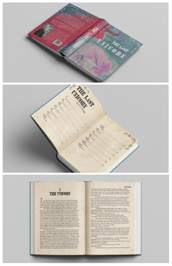
TLU: Book MockUp
Graphic Design
The Last Unicorn is by Peter S. Beagle and has been a staple for me growing up. I had this DVD for years (I still have it) and would watch the movie over and over. It was a big part of who I was and what really inspired me to make art in the first place. Then with maturity came the fact that there was a book beforehand! I read it during this project, pulling elements from it that you might not see in the movie, to really help with the remake of this cover.
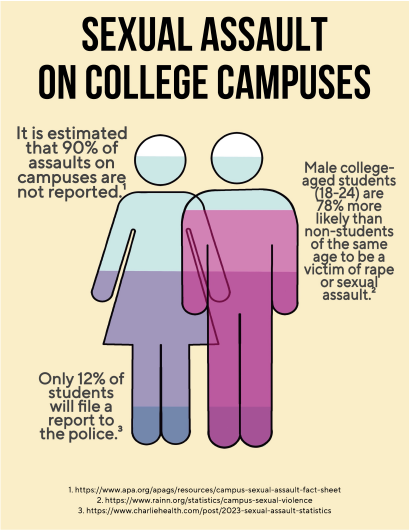
College SA Statistics
Graphic Design
College is rampant with crime that goes unregulated. Pulling from the statistics to get at least as close to that as you can, I found quite alarming numbers (and these are the undocumented ones!). Seeing this red flag, I developed a poster that would be in your face and as simplistic as other logo work so the audience wouldn’t get the message confused. I worked with a bold typeface for this exact reason. This was a warning not an observation.